The work.
Projects by challenge.
Projects by sector.
Bigger brand projects.
Projects with websites
Lovely little projects.
Just the logos.
All projects.
The words.
What we do.
Who we are.
Kind words.
Who we work with.
Recognition / Awards.
Contact.
Occasional journal.
Neon is an award-winning brand consultancy helping brands and organisations define what makes them different and navigate moments of change. We create clear, distinctive brands, campaigns and communications rich in character and with lasting impact.
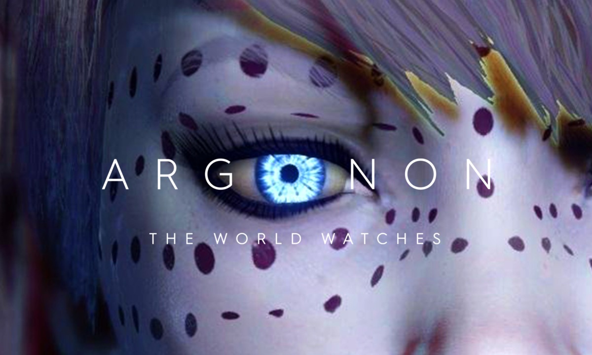
Argonon rebrand
The World Watches
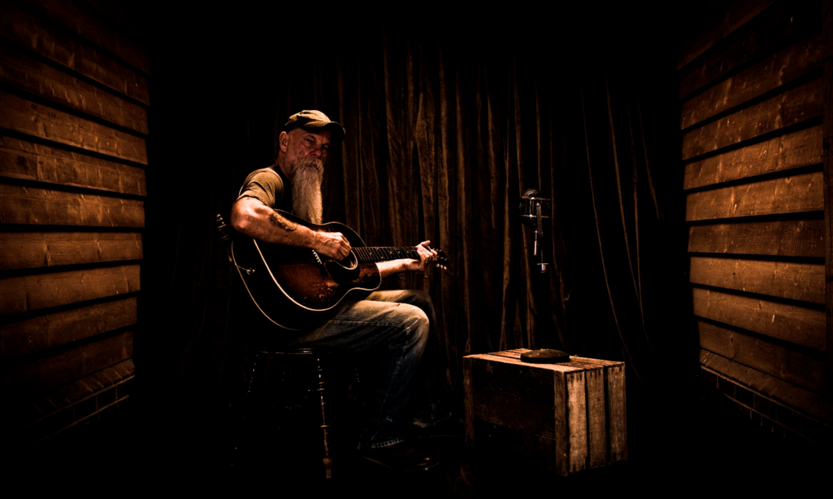
Seasick Steve
Video & album artwork
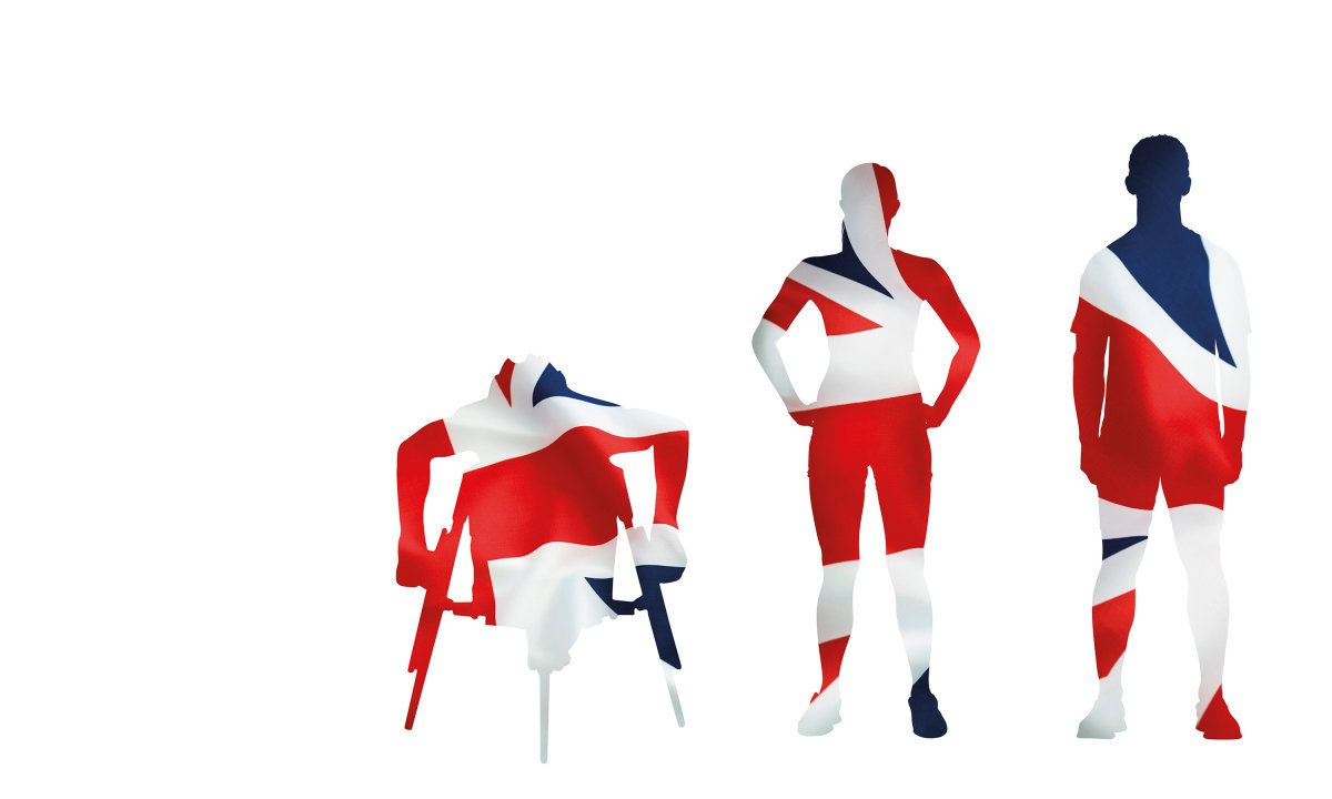
UK Sport Performance Pathway Team
Giving Team GB an edge
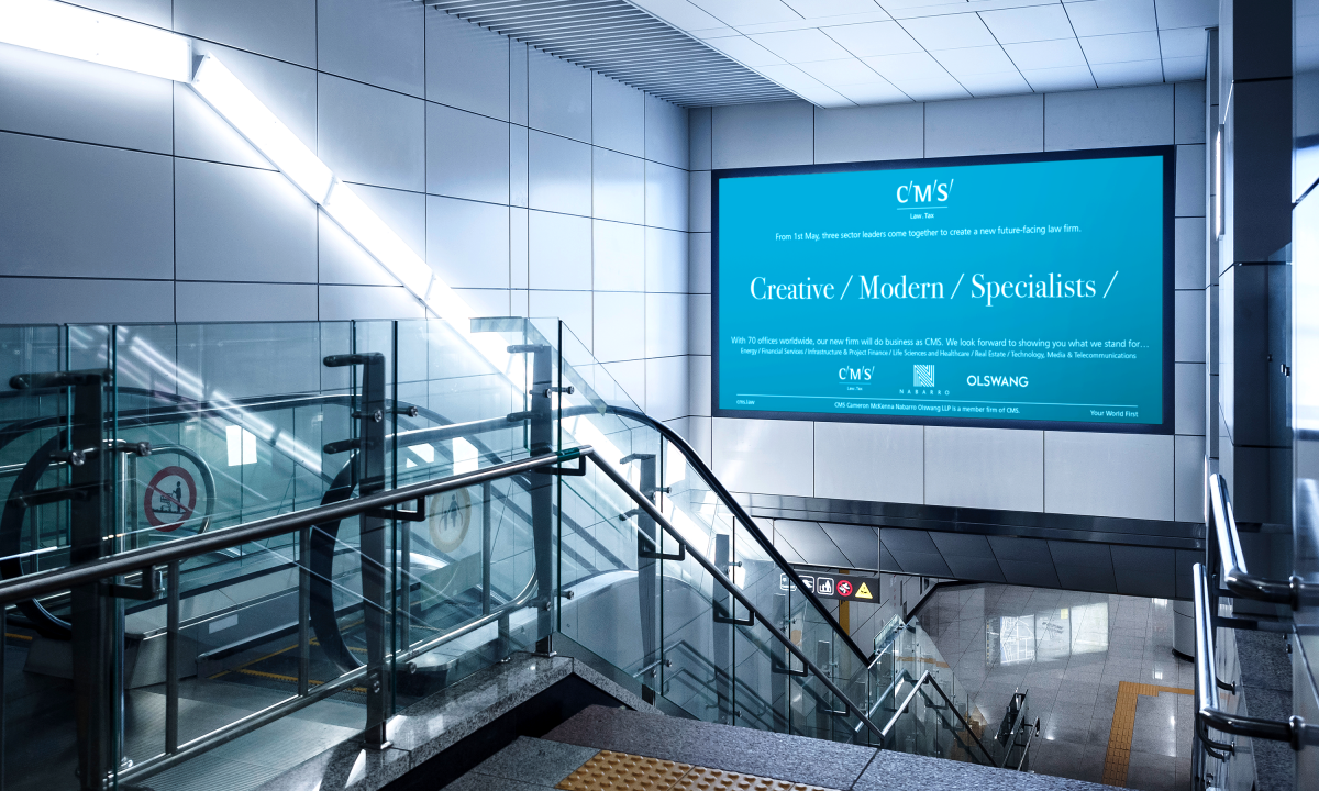
CMS Law
Competitive/Muscle/Strengthened
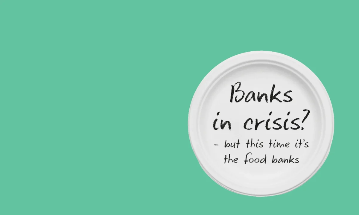
Food Bank Aid
‘There’s a new banking crisis’
I'm an Activist
for Action for Children
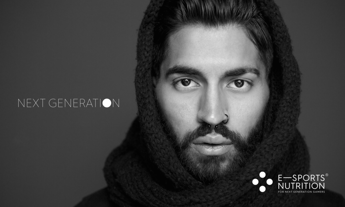
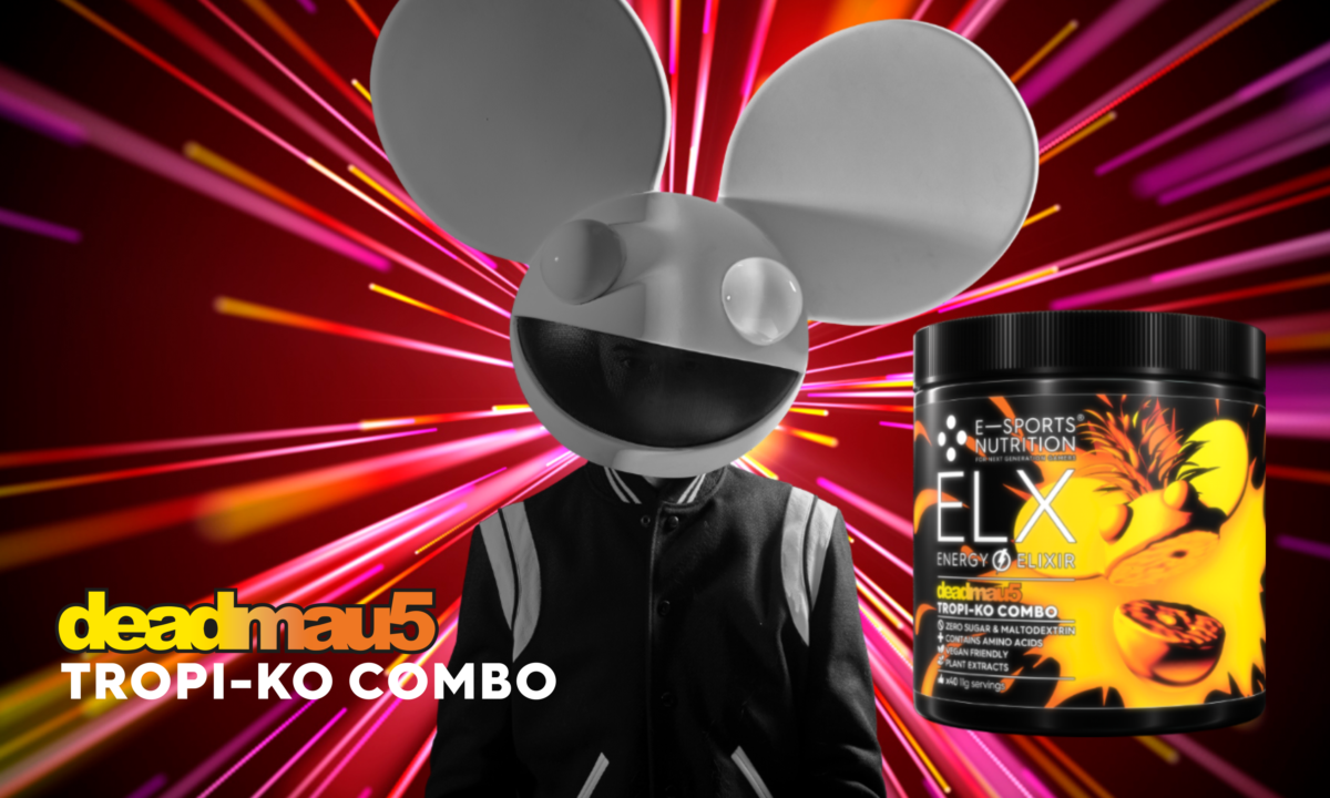
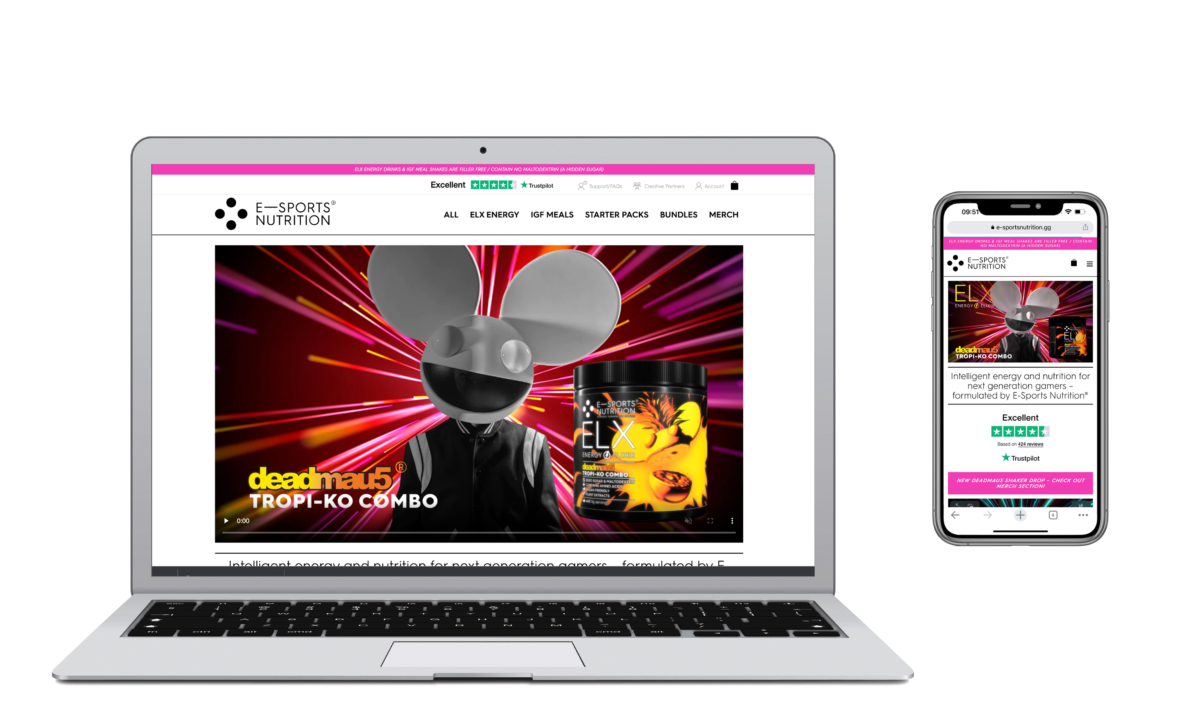
E-Sports Nutrition
Brand creation
E-Sports Nutrition
Promotional campaigns
Nabarro LLP
Clarity Matters
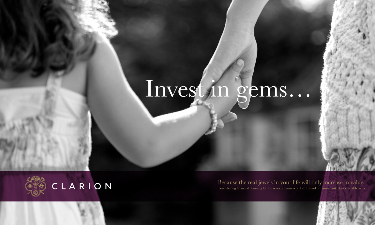
Clarion Wealth Planning
Branding
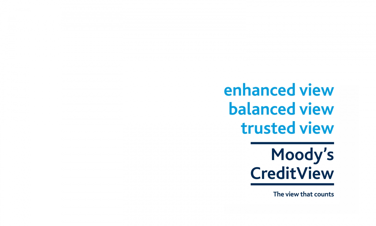
Moody's CreditView
The view that counts
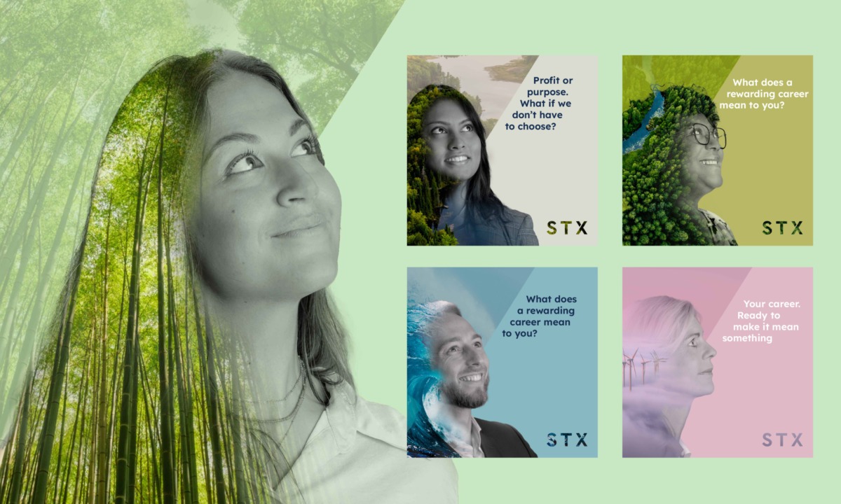
STX Group
Recruitment Campaign
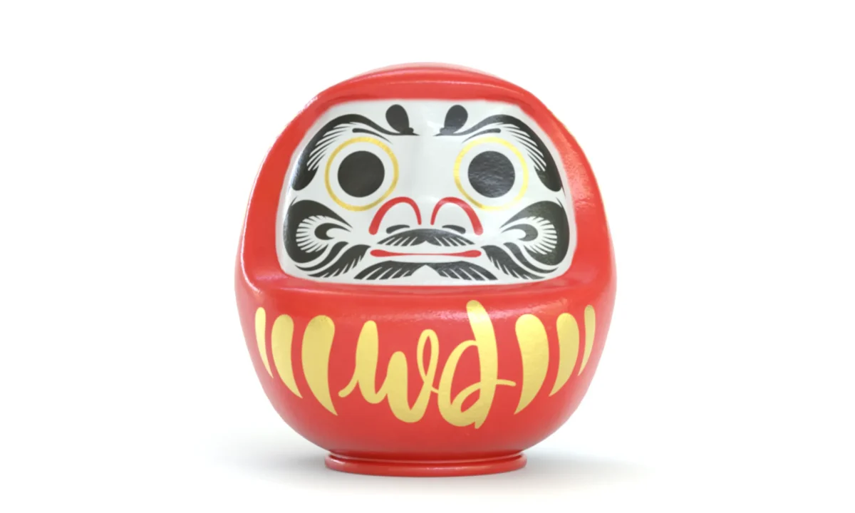
Wise Daruma
Rebrand & website
Moody's ESG Solutions
'Comprehensive' campaign
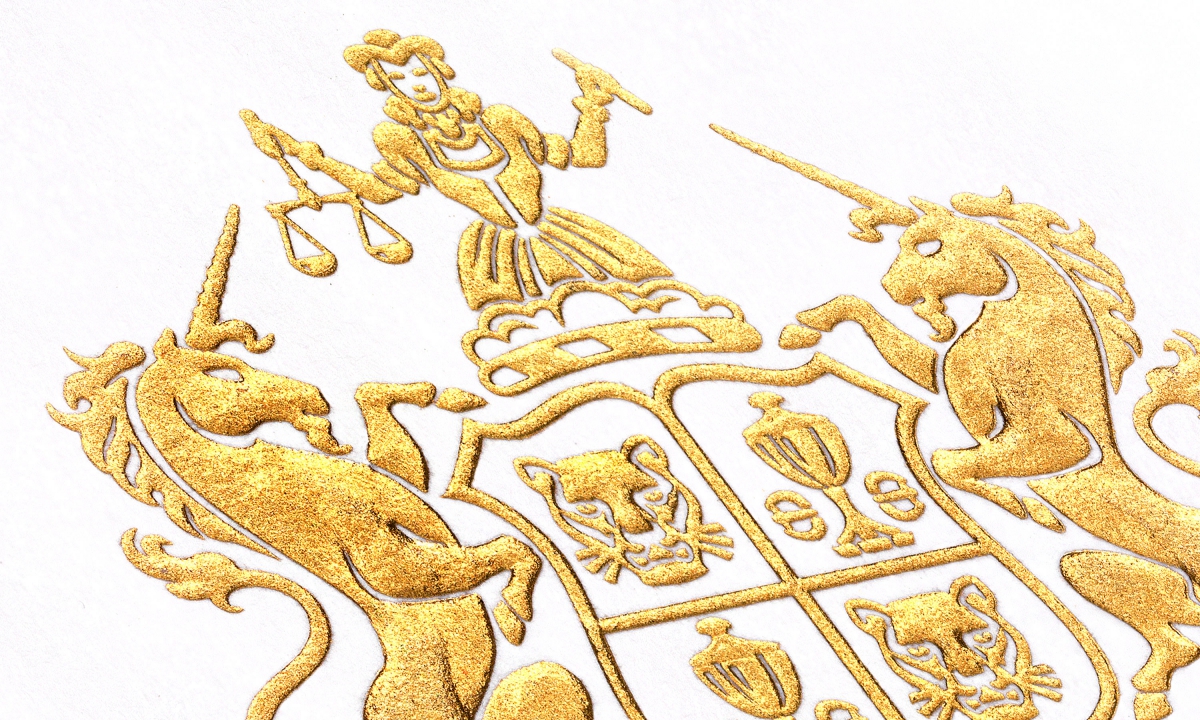
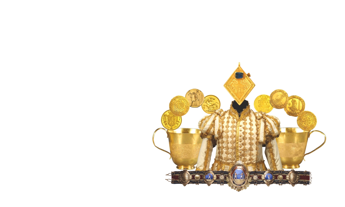
The Goldsmiths' Company
Brand positioning & identity
Kantar CX+
Creating X factor for CX+ Customer Experience...
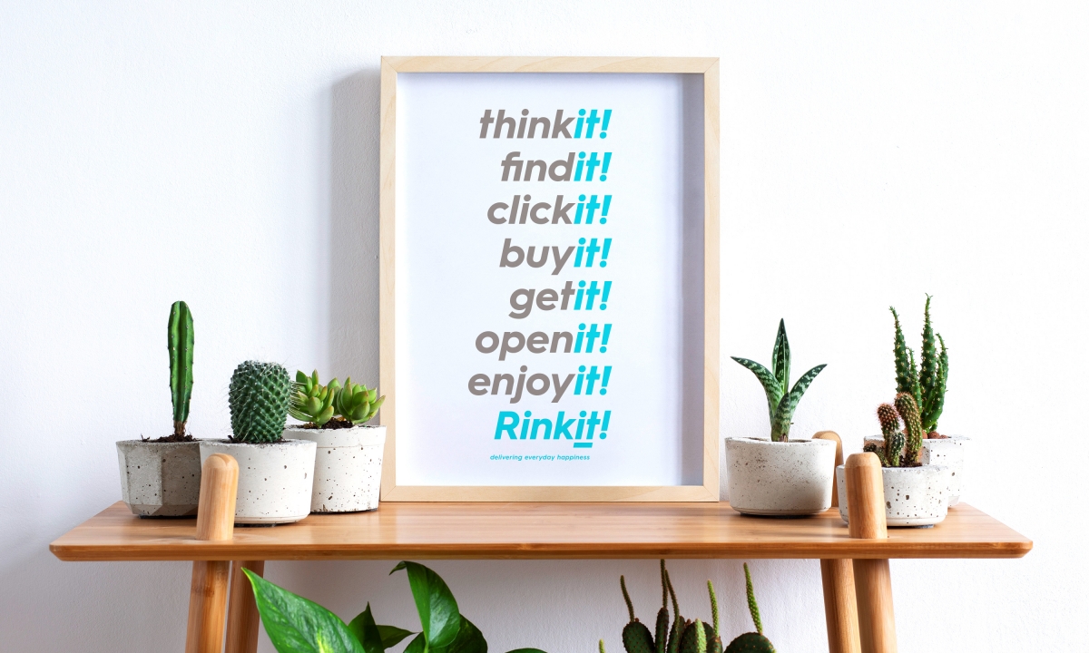
Rinkit rebrand
Rebrand & website
Nabarro LLP
125 London Wall
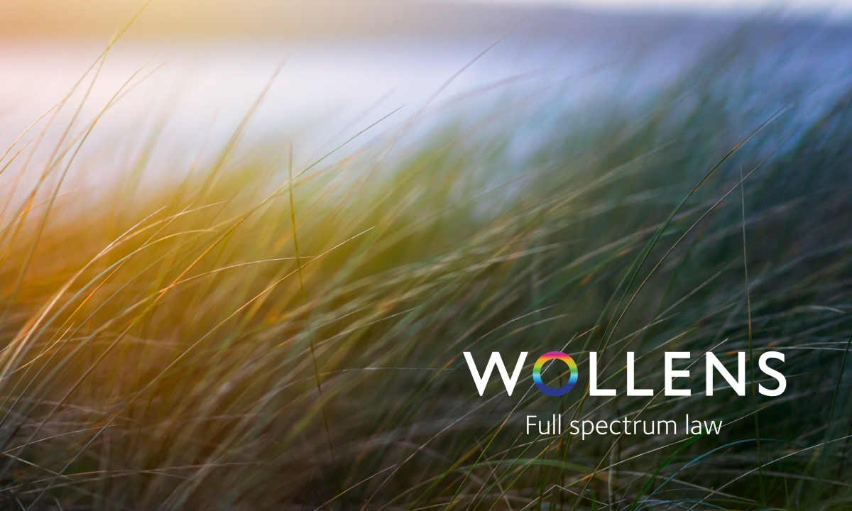
Wollens
The law firm that thinks in full colour – but keeps things black & white
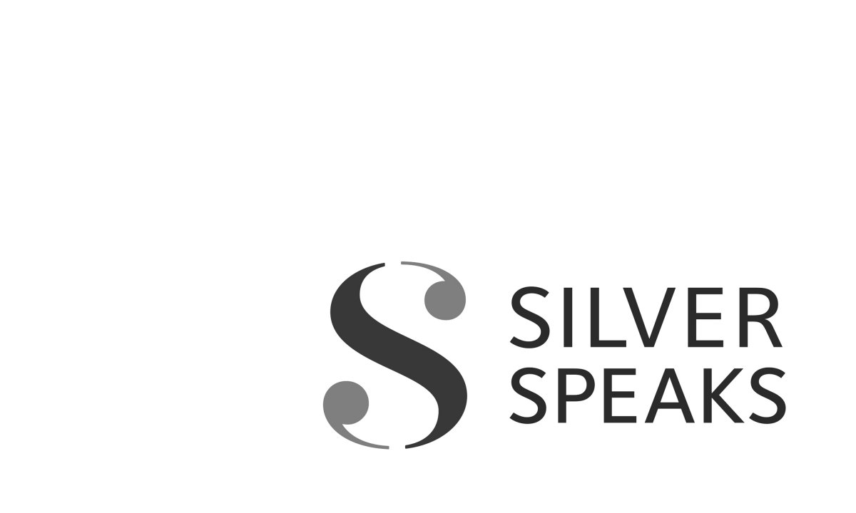
'Silver Speaks'
Exhibition & event branding
Field Court Chambers
Rebrand
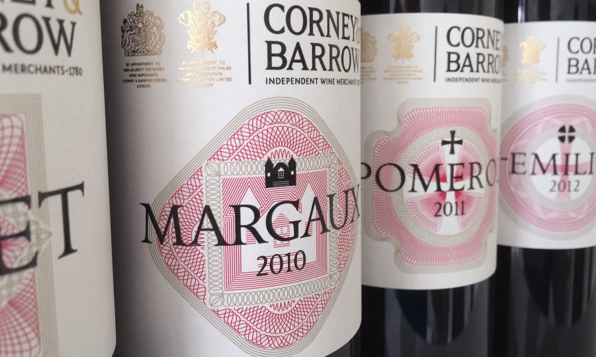
Corney & Barrow
House Range
Clarion Wealth Management
Advertising
Moody's ESG Solutions
Leading insight, championing change
Acumin
Adding a little personality to cyber security recruitment
Nabarro LLP
'Wonder-wall'
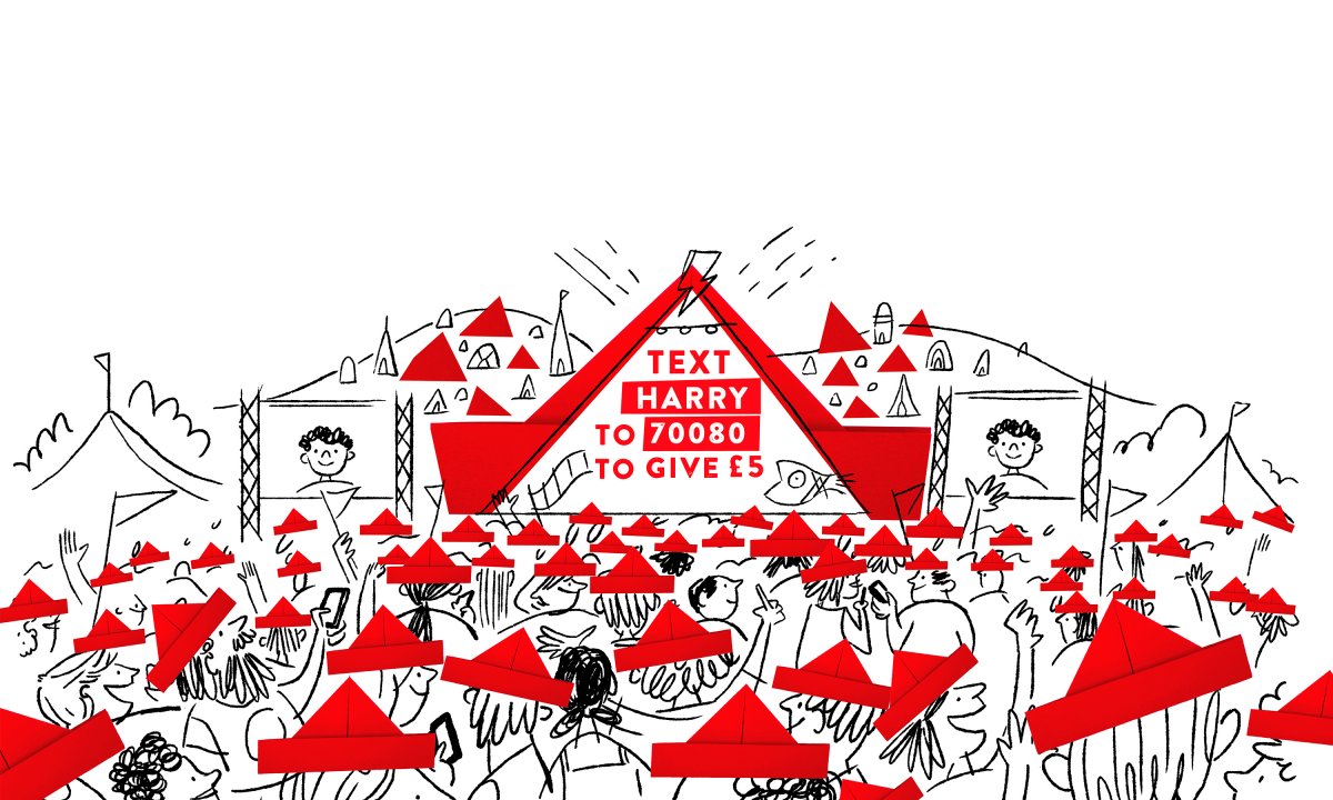
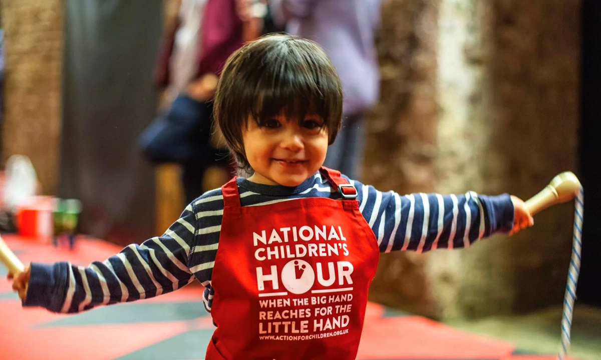
Action for Children
National Children's Hour
Natalia Schroder
Brand identity
Nabarro LLP
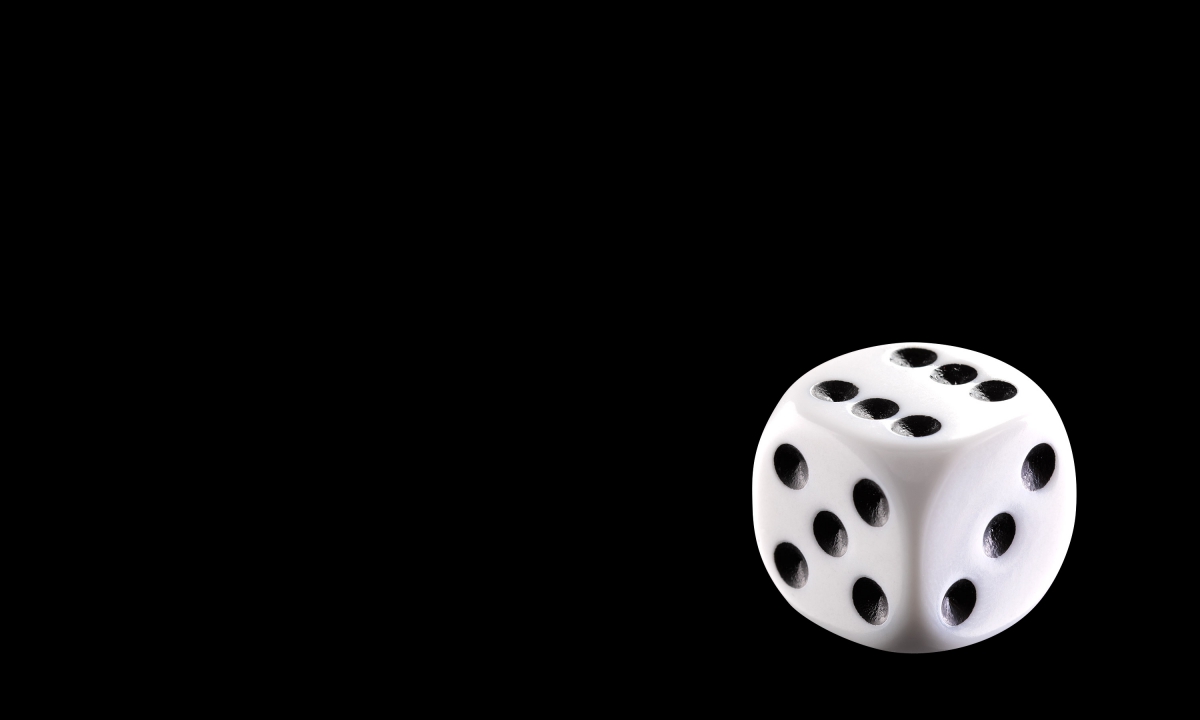
Your future as a lawyer.
Leave nothing to chance.
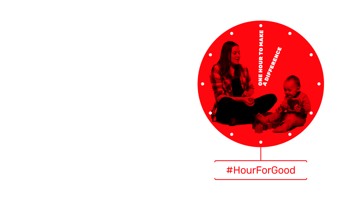
An hour for good
for Action for Children
The Goldsmiths' Company
Gold: Power & Allure
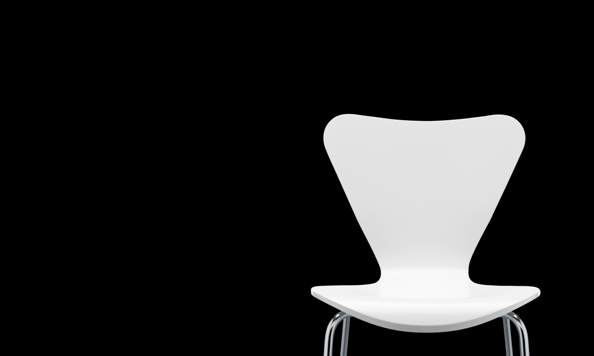
Nabarro LLP
Don't just warm a chair.
Find the perfect seat.
Thames & Hudson
60th Anniversary
The Castle Cinema
West Sussex pop-up cinema
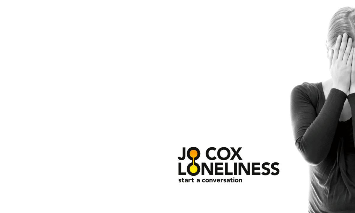
'It starts with hello' Loneliness campaign
for Action for Children
E-Sports Nutrition
Packaging
Sawhorse Films
Films with cut through
E-Sports Nutrition
Ecommerce website